5.30.2011

3014 and Odelay Tacos Fusion Mural


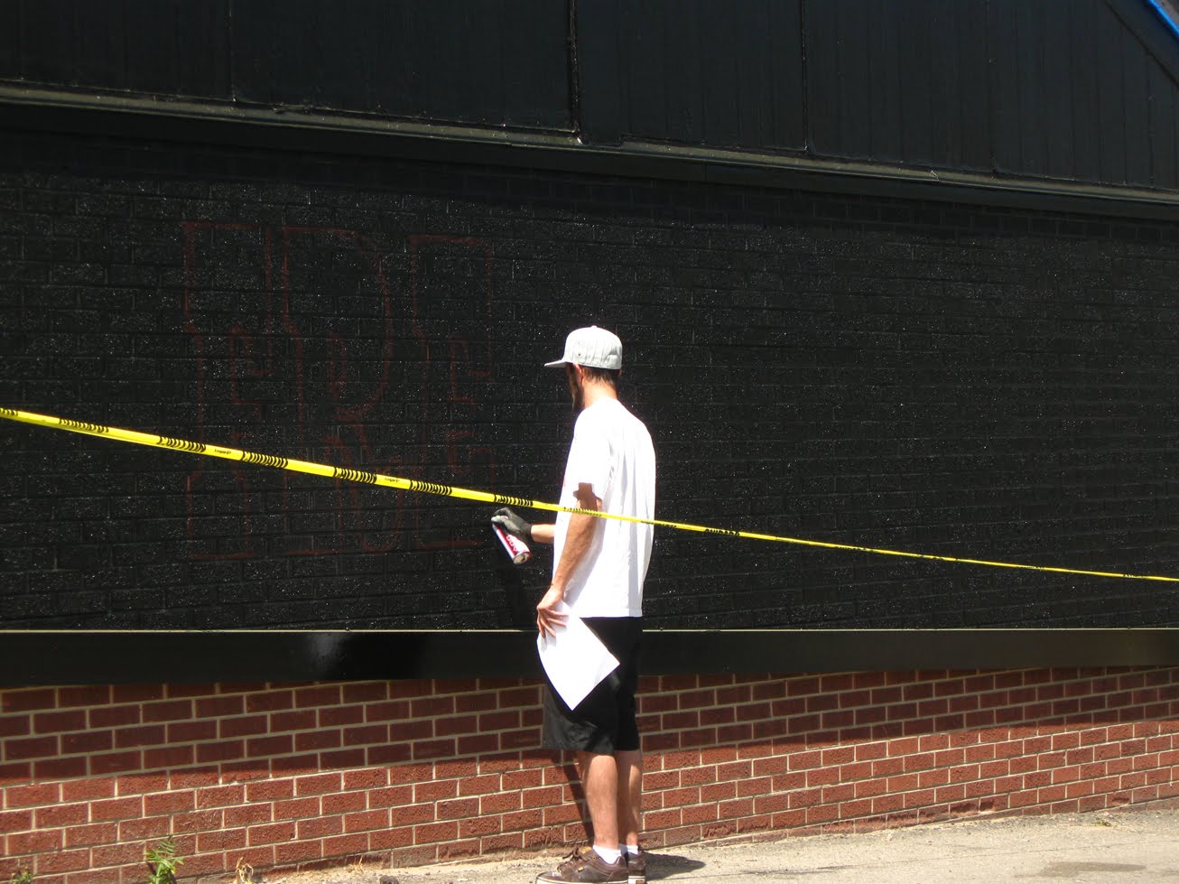
Some basic prep, process, and completed photos from a new mural located on the exterior of 3014 and the new fusion to the locale, Odelay Tacos. The classic Cadillac Mural is still in place, there is just a new decor to surround it, as well as some tasty tacos. The mural was basic black and white, but for anyone that underestimates the difficulty of two tone painting, beware, it can become a nightmare quickly without care and precision with what you are painting. The base is Rustoleum Black, and the entire painting is created with three diff kinds of white Montana Gold, All City White,Kilz White(Majority) and Rustoleum black for all clean up and edging. Great challenge, not for the in experienced. No stencils, friskets or any of that jargon, just hand painting and do it right or don't do it at all.


3014 Murals in Previous Posts: 59 Cadillac Install

5.23.2011

Todays Sketchbook Drawing

Posts are behind, steadily catching back up on current work. I draw everyday, and maybe thats a topic for another blog, but here is todays imaginative sketch. Pencil on 4" x 3" sketchbook. I felt it was male all the way through the sketch, and then for some reason the top knot gives it a feminine push. Thanks for viewing the work.

5.22.2011

The Sharpest Rides Service Department Concepts


A quick post, more custom signage and murals going in at The Sharpest Rides. Here are some of the latest concepts which havent been finalized so possibly a different direction will be taken, but so many concept sketches can be archived and re-used, cant tell you how many times I know I will reuse some ideas at a later date. These letters were drawn out and rendered with colored pencil.


The Sharpest Rides in Previous Posts: TSR Install

5.20.2011

Perl Mack Final Mural

As promised here are the final shots of the Perl Mack Concession mural that was completed about a month ago. I had posted the concept sketches, but hadnt gotten to this final. With help from my friend and fellow painter Ever we knocked both sides out in a few short hours, and the final product is fun, and a creative way of portraying sandlot games. Possibly more to come from the Little League Diamond, stay tuned and thanks for stopping by.


Concept Sketch Previous Post: Perl Mack Sketch


5.19.2011

Set In Stone Repress, RePaint


Some time ago, I had done a digital cover-up on the cover artwork for Set In Stone, and now I have repainted the full cover to match the logo that I created for the group, Prime Element.


Utilizing the same tromp l'oeil technique that was employed on 2009's Set In Stone album I set forth to match color, texture, and overall feel from a painting that I completed nearly three years ago. However, even with these difficulties, I took the task and tackled it as best I could. Above you can see the finished cover, I will post the full layout and you can see how the seam ended up working in a later post. Also check the past posts for the progress of this albums artwork, as well as its track listing.


Set In Stone Previous Posts: Cover Art 2009

5.17.2011

A.V.I.U.S. FBOW Digital

With the signing of Prime Element to Kamikazi Airlines, the group has been going through some major visual changes and revamps. One of which is a project that has been in the works for some time, Prime Elements Emcee A.v.i.u.s.'s sophomore effort entitled "For Better or Worse" which I had the honor of creating the album artwork for. During the course of the release of this album as well as the digital downloads I was asked to create a digital placeholder of sorts to put online. Knowing full well that we would be producing a painted cover of this image, I dove right in and completed this digital version utilizing my line drawings and Photoshop. With a tight deadline for the online release I didnt have an eternity to knit pic, but overall I am pleased with the product, and think it will only make for a great collectible once the final cover is completed.....it is in the works, more on that soon.


For more info on Prime Element, A.v.i.u.s., and Kamikazi Airlines click the names for links


5.16.2011

Brothers BBQ Final Sendhome size

Above is the final send home layout which I am proud to finally post and display. The layout and flow was changed a few different directions once every piece was digitized and ready for color and text manipulation. Each Homeslab that is purchased from a local Brother BBQ will receive a letter size printout of this illustrated D.I.Y. instructions to grill and sauce your very own Homeslabs. In addition, the large store display signs are 24" x 36" and show off a great deal of the time and details that tell the story of the adventures of the Homeslab Bros. I am having in store product shots and some other great extras and more info in a later post.


While you wait for those shots make your way to a Brothers BBQ and get some great food, and let me know what you think of the displays in stores. Thanks for stopping by.

Click to enlarge, Viewed better at screen size

5.11.2011

Brothers BBQ Ink Layout and Color Proofs

Once the ink stages had been completed I was placing all of the final drawings together into one large layout, with a comic book feel, but also a basic patterning and movement to the activities of the Homeslab Bros. seen on the illustrated advertisement. I also used the first frame, our introductory frame as the color sample frame and applied the beginning stages of the spot color to start pushing and pulling objects for impact. The ink drawings are completed as closed line drawings, so that when placing them into Adobe Illustrator to vectorize them, they can be easily filled with color. The next few steps were all digitally based such as colorizing each frame piece by piece, laying in text and placement of the text to lead the viewers eye, and ribbons and scrolls that the text would be placed on according to each section of the final illustration.

Brothers BBQ Homeslab Ink and Line Drawing


I began to ink each frame once I had gotten approval on the direction and theme corresponding to each scene, and as a whole. You can see from the drawings above that everything is indicated by line, whether it be dynamic elements such as screeching rubber and smoke from a vehicle, to the vacuum sealed packaging that the Homeslab is contained within. This is to hold the integrity of the drawing when I vectorize all the line drawings in the computer to apply spot color for the final piece. More on that in the color sample posts.

Brothers BBQ Adjustments

Further adjustments at a slightly larger than thumbnail size. As I began to ink each scene and hone in on details and specific elements to enhance the layout, I am constantly redrawing and replacing elements that I do not feel are as impactful as they should be. Above are changes to the Homeslab brother driving and hanging out his vehicle with his ribs, and additional frame elements such as the Homeslab in packaging to be used as an icon on the final layout.


Brothers BBQ Process and Composition


Further process sketches of the Homeslab Bros. and the compositional layout of each frame. The basic concept was to have the full layout be comic book based, but not as rigid as a classic tiling of the images. As these are sketched there are basic ideas about how each frame will tie in with the next, and how the flow will work when all the images are together in one single piece. These are all pencil drawings utilizing the initial thumbs and the lighttable, some reference involved at this stage.

Brothers BBQ Homeslab


A storewide illustrated ad campaign that I have been working on for some time is for the new sendhome ribs being produced by Brothers BBQ, entitled the Homeslab. Vacuum sealed and ready to grill at a moments notice, this has been a rewarding and fun project to work on. Over the next few posts I am going to put up the progress sketches, and digital translation as the illustrations became print ready for store display and sales. Above are the initial thumbnails and first framed layouts. Thanks for stopping in.

Dinger Hatch Giclees

I had a digital capture done of the Dinger Hatch painting done for multiple reasons. First off I have entered the piece in a few competitions, but lastly and most importantly I have some really nice giclees of the piece for sale. The original aerosol painting remains for sale, and the giclees color correction is great. Feel free to contact me through email or phone if interested.Giclees measure 8 x 10, and some larger sizes are available.


More Rockies Art and Previous Related Posts: Dinger Hatch Trading Card


5.09.2011

Final Nike Air Max Customs

These customs were completed and dropped off to the client some time ago, but I suppose that's a good thing that I am busy enough not to post them until now. The shoes were ordered and built custom at NikeiD, check em out pretty fresh customization software, and fun to use. From there they were prepped, primed, painted, painted again, and clear coated, ready to wear. All of the media used is acrylic or aerosol, and sealed with a flexible varnish. The imagery is distinct to the client, and was a blast to create, painting at such a small scale over leather always gets me excited.


For Info or Ordering Contact: delton.d@brokenbreadarts.com

5.02.2011

Wazee Union Second Saturdays & Air Max Detail


Some basic shots of a piece that I did as an experimental work, and resin coated to see a different result. I will tell you that I will be completing more pieces in this fashion. This piece was sold at the April Open Studio at Wazee Union, the home of my new studio. I promise I will dedicate a post to the space soon. The first image is a detail shot of the final Nike Air Max customs, final product shots and info in the next few posts. Thank you for taking the time to view the work.

For info or ordering info contact: Delton.d@brokenbreadarts.com