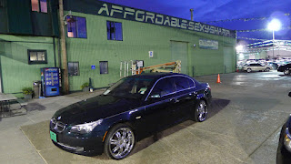
is a recent client piece for The Sharpest Rides, that was a big task, and turned out really clean. Here are some progress photos and final photos of the 100 ft letters. The process was a more concise one in which I utilized three stencils, "A", "S", and "R" to create all the font variations. By doing so I cut down on the working time, but also allowed for some more creative fun with the cadence and placement of each letter. I felt a more sign-painter approach would ensure that a one-tone font would be clean and correct, rather than a matter of wasting time on the lift and trying to measure cadence on the fly. It was all done by eye and general mural placement techniques. I did however do a great deal of prep and pre-measuring based on my prior knowledge of the TSR lot. For the ninth mural addition to the TSR collection, this piece is big and bold, and most defenitely lets patrons know what TSR is all about. A special thanks to Kevin, Hugo, Juan, and everyone else at the Sharpest Rides, look for more client projects soon. Thanks for dropping in.


No comments:
Post a Comment